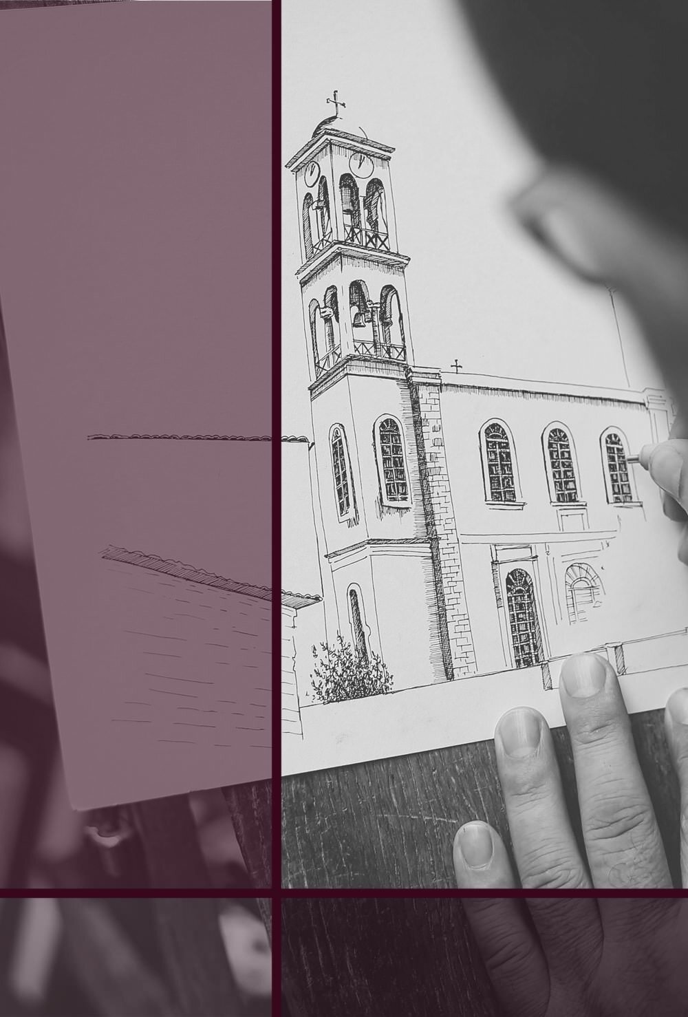
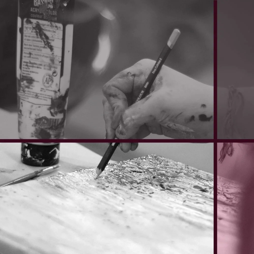
How to edit Photos of your Artwork the Easy way
In my last post I have led you through 5 simple tricks to take great photos of your artwork. Now that you know all about how to avoid shadows (or embrace them), how to deal with distortion, blurriness and reflections, let me show you what to do once you've taken the pictures.
These steps are just as useful and important if you happen to have a fancy scanner at home, rather than using your phone or another camera to digitalise your work.
Adobe Photoshop is the most popular choice for good image editing, but it’s also really pricey. Luckily, there are very similar, free versions online. Photopea looks almost the same as Photoshop and has many of its features. Pixlr X is perhaps a bit easier to use for newbies.
I'll lead you through all three of them, so you can choose which you like best, or can (and want to) afford.
One thing I’ve noticed in Pixlr X is that the images always looked quite blurry in the program. However, the saved image files are fine and perfectly sharp, so that’s something to keep in mind.
For my own artwork I have a certain order in which I go through these retouching steps. Most of it is intentional and necessary (such as cropping before changing levels). If you're unsure, just follow my steps in the order they're in.
1 Cropping
First of all, you'll want to crop your photo. Cut out everything you don't want to be visible, like the picture stand, or the tip of your cat's tail, who decided to strut around the desk just then.
There’s also an option to crop photos to the best ratio for specific social media platforms, but I usually do that as a final step and save it as a copy instead.
In all three programs: use the crop tool on the left and adjust the frame. Then press enter to actually crop.


2 Levels
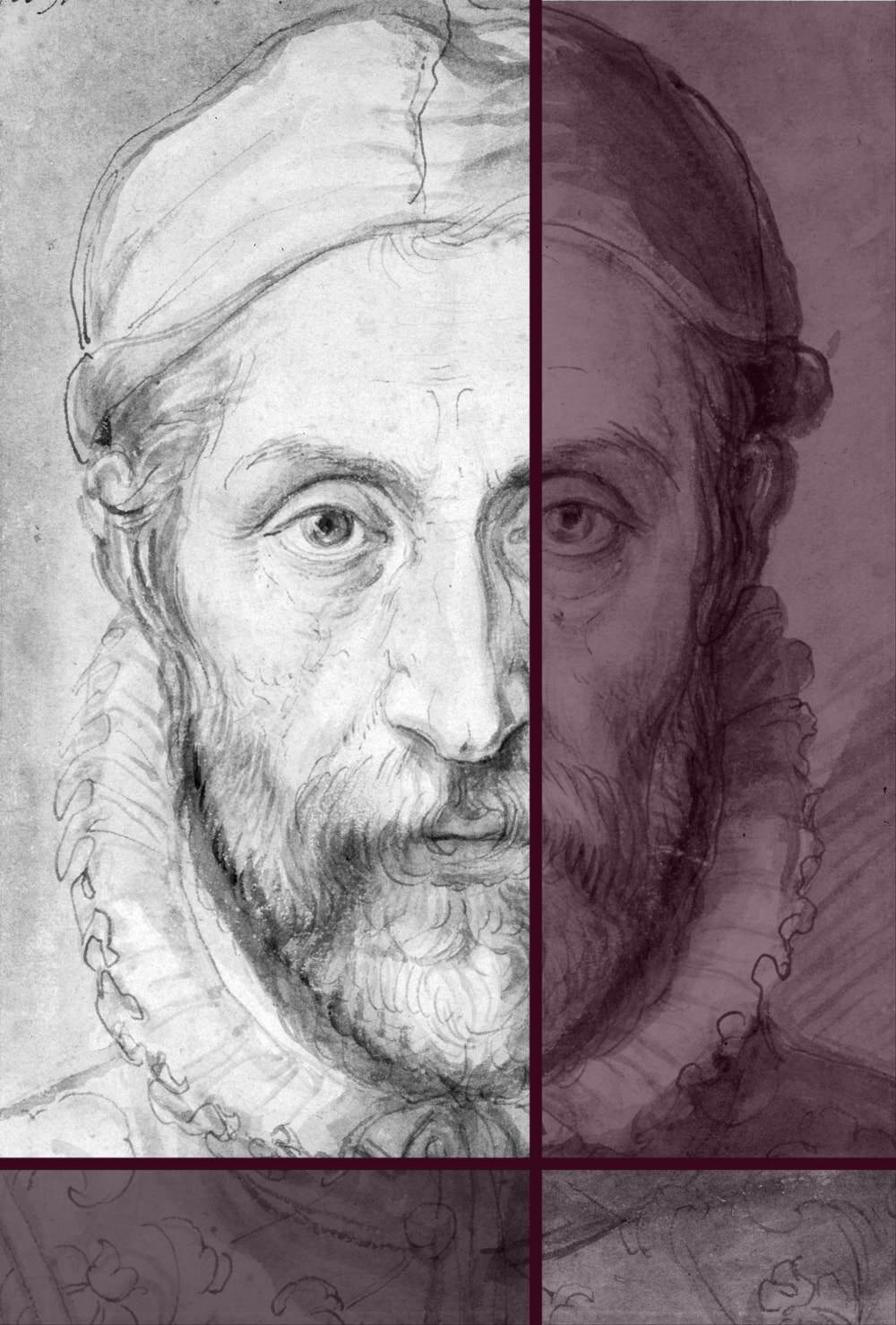
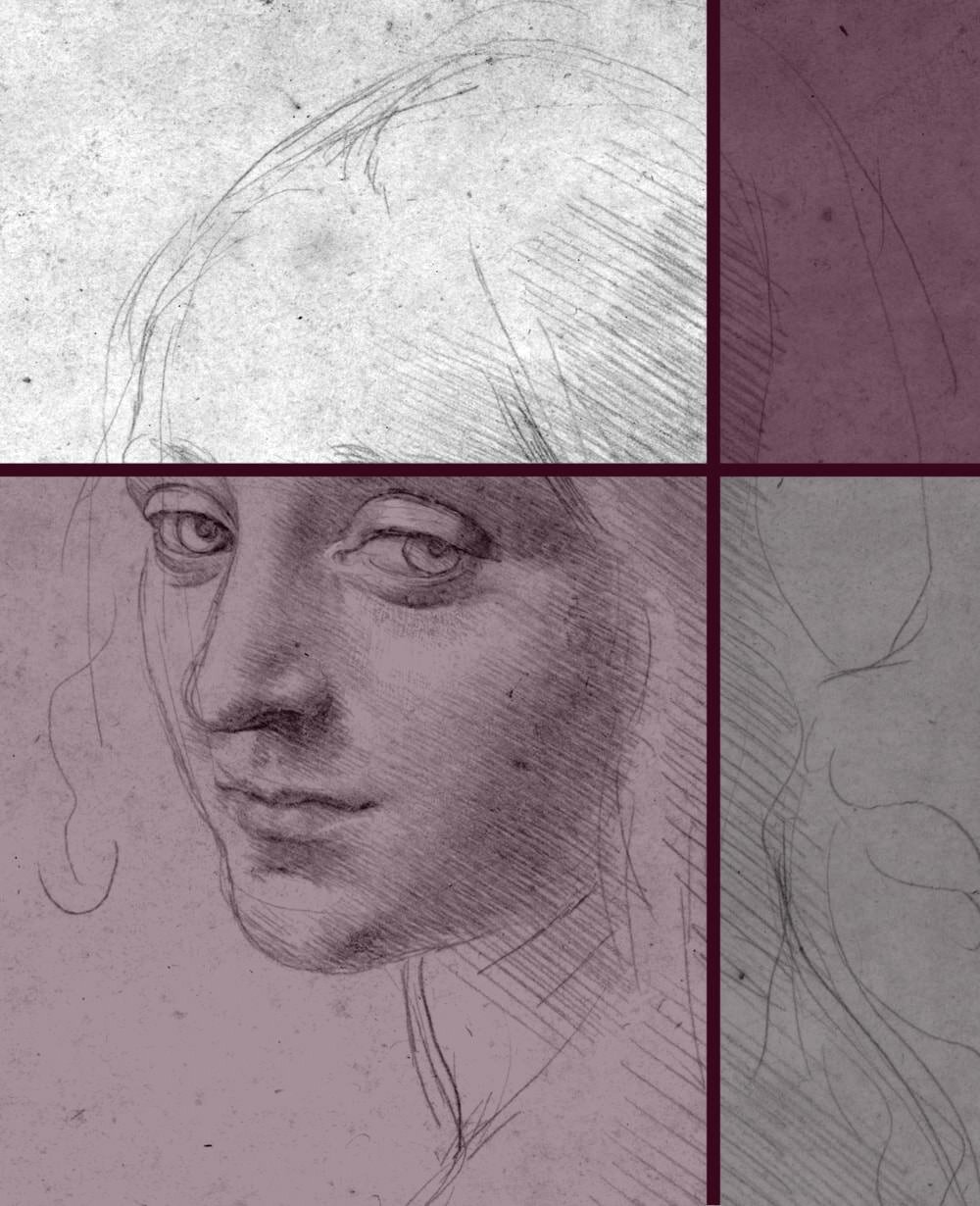
Next, you'll very likely notice that the image seems a bit too dark. The colours might be somewhat dull, and the white paper might look grey. Especially with pencil drawings, this can make the whole piece look very flat and washed out. Not to worry, we’ll adjust the levels a bit, that’ll make a huge difference.
If your artwork is a simple pencil drawing, you could turn it into grayscale before these steps (Image > Mode in Photoshop and Photopea. Pixlr X, to my knowledge, doesn’t have this feature). This gets rid of any unwanted hues, e.g. a bluish cast.
If your picture has colour, and you’d still like it in black & white for visual purposes, the grayscale option isn’t ideal. There are many other options for that, but they’re beyond the scope of this tutorial. Or you can of course just set your camera to take pictures in black & white.


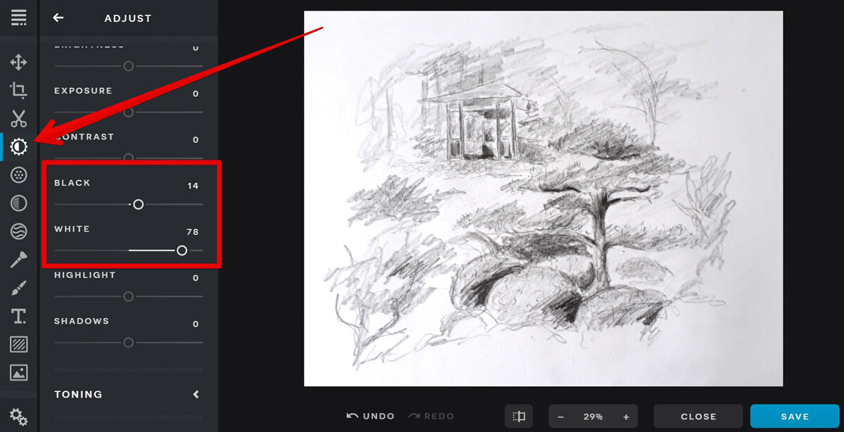
In Photoshop and Photopea: go to Image (at the top) > Adjustments > Levels. You’ll get a popup window with several sliders in different shades.
The white slider regulates the lighter tones; the grey one the tones in the middle and the black one the dark tones. Often you’ll notice that the white and black sliders are not actually where the histogram begins. Move them closer together to match the actual beginning and end of black in the histogram.
In a pencil drawing I usually move the white slider even further left (to make the paper even whiter). That’s something that very much depends on the drawing, though. If you go overboard here, you’ll lose some of the finer pencil marks.
The level of adjustment needed is different for every photograph, so I can’t tell you how far to move the sliders (the auto function usually doesn’t give ideal results). The best option is to simply move them around a bit to find the best setting for your photo.
In Pixlr X: There’s no setting as refined as levels in Pixlr X. However, you can adjust black and white tones in the Adjust settings to get a similar result.
3 Adjust colours
This is not needed for black & white pencil or charcoal drawings, but it’s often necessary for other work. There are many different settings in Photoshop, Photopea and Pixlr X to change the colours of a photograph. I’ll lead you through the two that I use most frequently.
A word of caution here before we start: Remember that every monitor or laptop screen will show colours slightly different. What’s emerald green on one screen may appear moss green on another.
There’s really not much you can do about this, other than testing your image on different screens and finding a setting that works on all.
I also recommend not to go overboard with the colour changes, as it may adversely affect the integrity of your artwork. You'll want to correct technical shortcomings due to the equipment used or the light available, not completely change your piece (unless you’re doing digital art, of course).
For a start, let’s make sure that the colours of the photograph resemble what the original looks like, starting with the Hue/Saturation function.
In Photoshop and Photopea: Image > Adjustments > Hue/Saturation. Move the sliders around until you’re satisfied with the result (use the little preview tick box on the right to see the difference).
In Pixlr X: The Adjustment tab has a Hue and a Saturation slider, but do feel free to play around with the other options there as well.


When that’s done, you might find that most colours are close to the original artwork, but not all of them. No problem, we have the Selective Color function available (it bothers me to spell ‘Color’ this way, but that’s what the function is called). Here you can choose specific colours (that’s better) to update.
Using this functionality correctly requires a little knowledge of colour theory, as it enables you to digitally mix colours like you would with paint. For example, adding more yellow into the green tones will give you a mossier green; more cyan will make it more emerald.
Keep in mind that changes here will affect the entire picture. If you change the green tones to get a meadow to pop, it’ll also affect any other bits that are green or are mixed with a lot of green.
In Photoshop and Photopea: Image > Adjustments > Selective Color. Pick the colour in your picture that doesn’t look right and add or remove mixed colours from it with the sliders.
If the colour doesn’t seem to change it’s likely that it’s not mixed the way you think it is. Just try some other colours to see which one will give you better results. Here’s an example: if the clouds in your picture aren’t the right shade, chances are you’ll need to adapt blue, grey or yellow tones, rather than white.
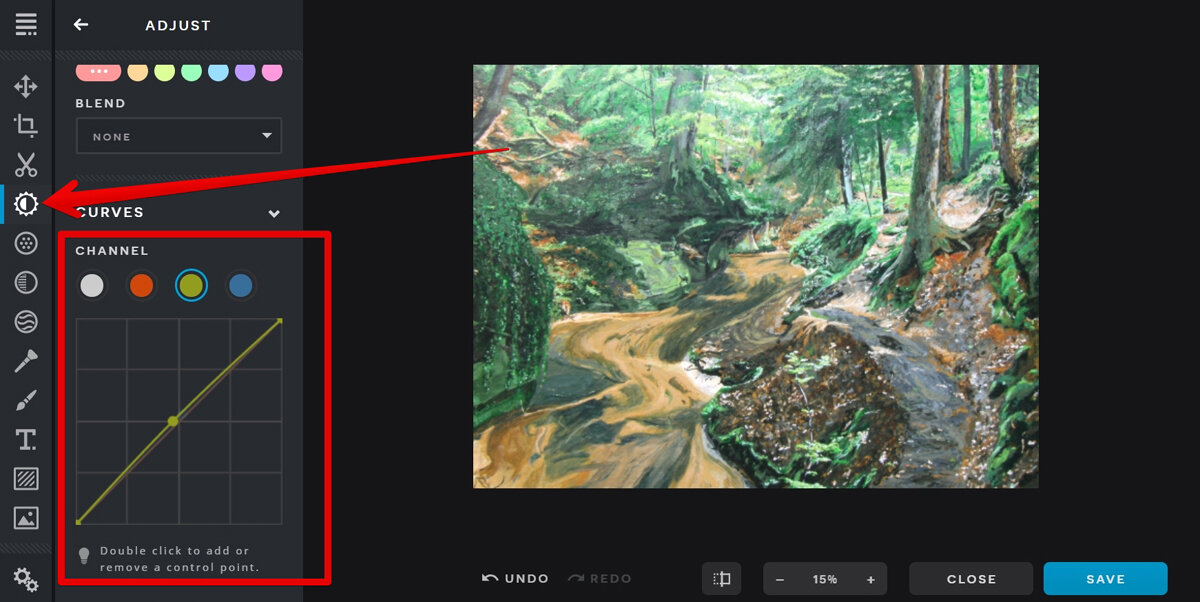
In Pixlr X: It’s a bit less targeted, but in the Adjust tab under Curves (right at the bottom) you can try and play around with red, yellow and blue tones in your picture. This function works similar to Photoshop’s Curves.
Double click on the line for the specific colour you want to change to add a control point. Then move that point around the grid to intensify or weaken the colour. The bottom left will influence the darker tones more, the top right the lighter ones.


4 Remove impurities
Now for the fun part. Quite often you’ll find that there are some impurities in your artwork, such as a piece of fluff that landed on your scanner’s glass plate and is now part of the image.
All three programs we’re using today have very easy options to get rid of these without a trace. Basically, what you do is copy a different area of your picture and stamp it on the impurity to cover it up.
Usually you’ll copy from right next to the impurity to avoid any difference in darkness or shade, but it depends on the picture. In all cases the stamp size (and thus the area you retouch) should be as small as possible.
In Photoshop and Photopea: Use the Stamp tool to copy an area by holding the alt key on your keyboard and clicking with your mouse on the part you want to copy. Then release alt and click on your impurity to stamp.
In Pixlr X: The stamp tool is located in the Retouch tab and works the same, but you use the shift key on your keyboard instead.


5 Sharpen
In many cases, your artwork will also benefit from a quick sharpening filter, just because it's really difficult to hold your phone steady enough to take a perfectly sharp picture of a drawing or painting.
In Photoshop and Photopea: Filter > Sharpen > Sharpen. That’s literally it. Doing this once is usually sufficient, as you don’t want to make your image look unnecessarily pixelated.
In Pixlr X: There’s a Sharpen slider under the Filters tab, which I actually like better than the Photoshop and Photopea option. However, as mentioned above, if your version of Pixlr X tends to display images a little blurred to begin with make sure you’re not going overboard with this.


6 Resize
If you’re planning on using the picture on social media or your own portfolio website, a good final step is to change the image dimensions (width and height) and reduce the file size. Make sure to save a copy in the original size, in case you ever want to print it.
Some social media platforms will automatically resize an image at upload, but you can also change the dimensions and even aspect ratio beforehand. The best sizes for Instagram, Pinterest, Facebook and so on change frequently, so best to do a quick Google search every now and then to make sure you and the social media platform are still on the same page.
If you’re posting your images to several social media outlets, you may have to save several copies in several sizes.
On some social media platforms, an image will look better in portrait orientation (higher than it is wide). If my original image is in landscape orientation, I’ll crop it (see point 1) around the best part of the photo, provided the scene allows for that.
For most online use I reduce the dimensions to 1500 pixels maximum for the longest side, after the final cropping. The resolution for digital images is conventionally set to 72 dpi (that’s dots per inch), which is perfectly sufficient for regular computer screens.
In Photoshop and Photopea: Image > Image Size. Make sure you’ve got the little chain symbol activated as that’s what keeps your image proportions intact. And of course you’ll want to work in pixels as a measurement, unless you plan to print it out.
In Pixlr X: You can adjust the size (in pixels by default) in the popup right when you upload the image. Later you can click on either the Arrange tool or Crop tool.


And finally, you might want to run your images through a file size compressor. I personally use Optimizilla (online) or JPEGmini (desktop version), but there are many similar ones out there.
Especially for a portfolio website it’s good practice to keep the file size small, ideally under 500 MB (megabytes) per image. You can right-click on the image file on your computer and select Properties to see the file size.
This is important for retaining reasonable loading times with slower internet connections. Most social media platforms will reduce the size (and quality) of uploaded content automatically.
And that’s it. That’s all I do to my artwork photographs and scans on a regular basis. If you’re not used to editing software it can look a bit overwhelming at first, but I’m sure this little guide will help you get used to it in no time.


Did you enjoy this article or feel like you have anything else to add? Feel free to leave me a comment below!
If you like this post, please share it, so others may like it too!

